This interesting crossover of publishing, art and biology was recently brought to my attention:
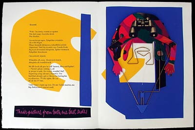
EPIDERMIS: The Poetry of Skin is a collaborative effort from photographer Doug Prince and poet Scott A. Gallaway, and includes an interpretive essay by Andrew E. Hershberger. I found the images to be beautiful, and the sample pages
available for viewing here are quite compelling.
Artist's Statement:
"Epidermis is the outermost layer of the skin. It forms the waterproof, protective wrap over the body's surface and is made up of stratified squamous epithelium with an underlying basal lamina." - The Encyclopedia of Medical Terms
"These images are the latest state of a body of work started in 2005 titled, Dermis. I am interested in transforming digital images of human skin into new, graphic compositions. I select images as a working pallet based on color, texture and gradation, and their potential to lend themselves to my own aesthetic interest. Then I digitally reconstruct them into new forms, surfaces and lines. The resulting images often parallel forms found in geological, anatomical, and biological subjects. I am motivated by the joy of creating new organisms and the discovery of new landscapes. I am also interested in maintaining some of the original photographic details, as artifacts, in the new composition. This allows a play and tension between these photographic elements and the abstract frameworks in which they are embedded." ~ Douglas Prince
I got in touch with Prince to ask a few questions about his work on this project:
BA: You have a large portfolio of artwork on your site. What inspired you to create a book of your photographs?
DP: The book format seemed like a natural culmination of a body of work and an extension of the digital process. It was something that I could organize and design and present to an audience. Although the distribution is a challenge and the audience is small. Since I couldn't find a "regular" publisher, I decided to setup Maple Seed Press and do it myself.
BA: How did you choose this body of work to present in a book form?
DP: I was working on EPIDERMIS, at a time when Andrew E. Hershberger and I were both teaching at the New Hampshire Institute of Art. Andrew was teaching a history of photography course and I was teaching photography. We started spending time discussing photography and related topics, he became interested in the work I was doing and I was very pleased that he was interested in working on an interpretive essay for the book project. This was an inspiring and fruitful partnership, we worked together discussing the concepts in the essay and he participated in the editing of the images.
BA: Was the experience of gathering your artwork into book format and collaborating with Scott Gallaway a positive one?
DP: Andrew introduced EPIDERMIS to Scott when he returned to GBSU, Bowling Green, OH. Scott responded to the images and asked if he could do a set of ekphrastic poems for each page. I was delighted with this addition to the book. Both Andrew's and Scott's contributions have expanded the insights into the work.
BA: Do you have plans on publishing other books in the future?
DP: The next big project I will be working on is a 50-year retrospective (from silver to pixel), collaborating with Andrew. Hopefully we will get the interest of a museum and publish a catalogue.
I would like to acknowledge an important influence: Ralph Gibson's understanding of the beauty and power of the book has been both instructive and an inspiration. He published his work, pre-digital, through Lustrum Press, 1970-1985.
http://www.ralphgibson.com/
~~~~~~~~~~~~~~~~~~~~~~~~~~~~~~~~~~~~~
Other book-form projects by Prince: The exhibition catalog for
All Possible Worlds and
Evolving Vision: Explorations in Digital Image-Making. You can see more of his artwork and larger, more detailed views of the sample pages for EPIDERMIS at his website,
DouglasPrince.com. The book itself is available for purchase
here.

 Edited by Dan T. Ghetu, this homage to one of Soviet Russia's most well-known author and playwright contains twenty-one original stories. Contributing authors include Allyson Bird, Adam Golaski, Rhys Hughes, and more.
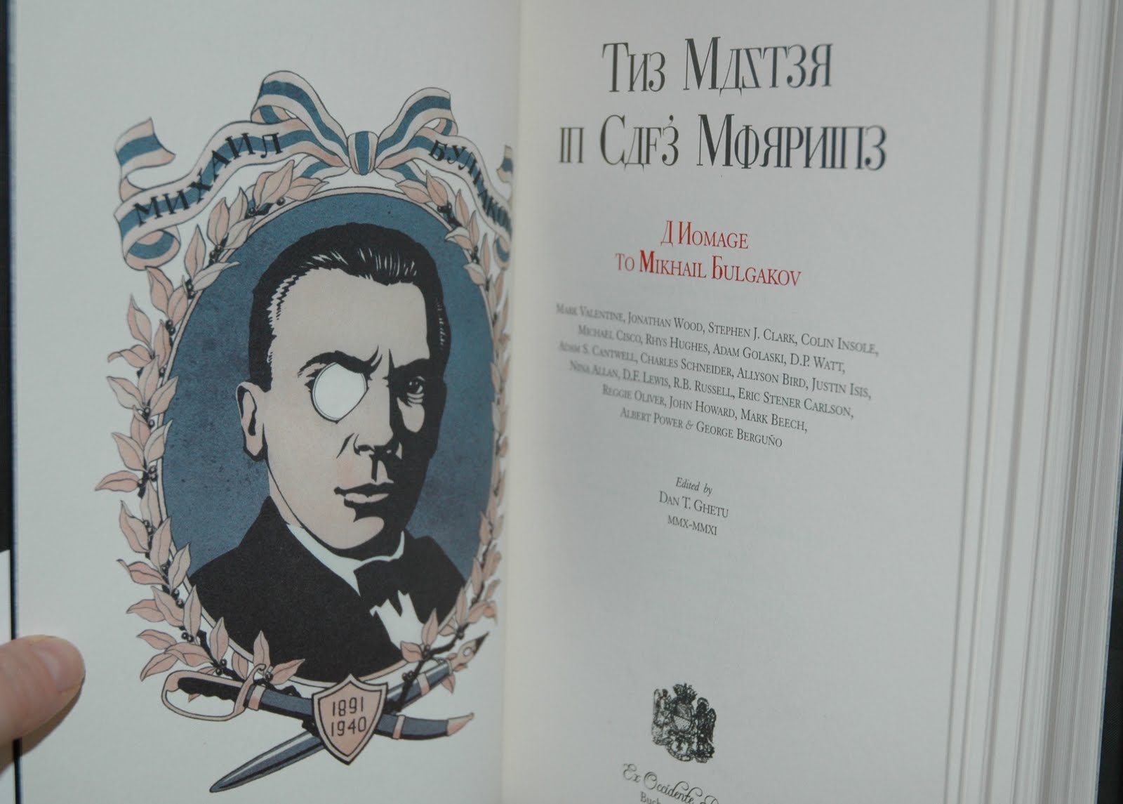


