Saturday, December 10, 2011

Again with the Macabre


Grimscribe
by Thomas Ligotti

Dust jacket by Aeron Alfrey.
Limited: (sold out)
Trade: (sold out)
ISBN: 978-1-59606-409-6

Hello friends!  My apologies for my long hiatus.  My day job has been overwhelming stressful and it's sapped all of my energy.  I do still manage to keep up the original Book Aesthete, since it takes quite a bit less effort and focus than this one.

So today I shall tell you about about the illustrator of the above book.  Grimscribe, published by Subterranean Press,  is sadly no longer available.  But I was reminded of it today when I ran across a blog entry by the illustrator, Aeron Alfrey

Alfrey is an incredibly talented illustrator who specializes in the macabre.  He curates the blog "Monster Brains" which is an absolute treasure trove of books, illustrations, and various images of monsters and grotesqueries.  He was featured in "The Thackeray T. Lambshead Cabinet of Curiosities" which came out earlier this year, and his work has appeared in numerous books and exhibitions (and the odd album cover, too.)


Illustration from Grimscribe

The reason I bring this up today is that Alfrey is offering a limited run of prints from the book.  Visit his site for more details.

Sunday, October 9, 2011

"Poetry of Sappho" with prints by Julie Mehretu

According to Arion Press, November 2011 will see the publication of "Poetry of Sappho" with prints by Julie Mehretu.  No images are yet available on their site, but given what I've seen of her work on the 'net, this is bound to be a unique combination of poetry and art.

Mehretu, Untitled etching, 2009
"An Ethiopian-American painter known for her densely-layered abstract images, [Julie Mehretu]  lives in New York City and works there and in Berlin. She received the 2005 MacArthur Fellowship. In 2009, Arion Press’s Andrew Hoyem and Diana Ketcham met with Julie Mehretu in Berlin, where she was working on “Grey Area,” a series of seven large paintings for the Deutsche Guggenheim, shown also at the Guggenheim Museum in New York. She came to San Francisco the following spring and began work on an Arion Press edition of Sappho’s poetry."  (text from Arion Press)

Mehretu, Manifestation, 2003
Her style is a good match for the classic poems of Sappho.  From Sacred Texts.com:

"Sappho the poet was an innovator. At the time poetry was principally used in ceremonial contexts, and to extoll the deeds of brave soldiers. Sappho had the audacity to use the first person in poetry and to discuss deep human emotions, particularly the erotic, in ways that had never been approached by anyone before her. As for the military angle, in one of the longer fragments (#3) she says: "Some say that the fairest thing upon the dark earth is a host of horsemen, and some say a host of foot soldiers, and others again a fleet of ships, but for me it is my beloved."

Poetry of Sappho is usually associated with more traditional, or classic, or Rubinesque paintings (forgive my ignorance of appropriate art-lingo) such as Lafond's "Sappho Sings For Homer" or this 2nd image that I'm having a hell of a time identifying (anyone?).  Mehretu's interpretations promise to be a completely new experience.

Landford's Sappho Sings for Homer
Unknown Artist


More about the upcoming book:  "This large format, 14½ x 19½ inch, 112 page, book contains 20 double-page Mehretu prints in black and white. Another of her images is on the cover. The English text has been set by hand. Printed by letterpress and hand bound, the book is issued in an edition of 360." (text from Arion Press)

Although the price is well beyond my budget, I'm very much looking forward to seeing pictures of this - it is going to be amazing.

More information and pre-ordering available at Arion Press.

Sunday, September 11, 2011

C.C. Askew of Sekretcity International

C.C. Askew first came to my attention as the illustrator of the be-monocled portrait of Mikhail Bulgakov in "The Master in Cafe Morphine: An Homage".   While poking around on the internet today I discovered his blog and this lovely cover artwork for J.M. Coetzee's "Waiting for the Barbarians":


And another book cover, this for the Ukrainian poetess Iryna Shuvalova:


Askew has also been featured in both Coilhouse and in N-Sphere. Please visit his blog and his website to view more of his artwork - it is quite striking!


Tuesday, September 6, 2011

Not too early for the Halloween Season, is it?

Earthling Publications is a fine press publisher specializing in "exceptional horror, dark fantasy and suspense".  Naturally this piqued my interest as it's my favorite literary genre, so I dove in to see what was what.  One of the first books I came across was China Mieville's first novel, 
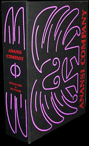
King Rat, pictured below: illustrated by Richard Kirk, bound in bonded leather, slipcased, and signed by Mieville.  Tho, sadly, no longer available (although I managed to get my mitts on a copy).

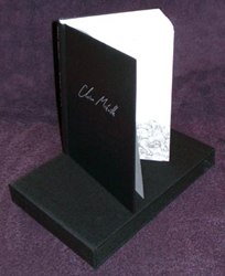
King Rat by China Mieville
This certainly bodes well!  However, this particular blog post is not intended to focus on their everyday, run-of-the-mill fabulously custom bound and beautifully illustrated selections.  (We'll get to those another day.) This post is about Halloween.  Because, not only does Earthling Publications specialize in horror on a daily basis, they also have an ultra-special Halloween series of finely bound books.

Below, Mr Dark's Carnival, 2004 - which sold out immediately:

Ticket artwork embedded in cover
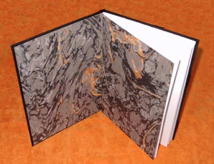
French Marbled Endpapers
From the site:  "This book is an ultra-limited hardcover edition of Glen Hirshberg's haunted house novella MR. DARK'S CARNIVAL, featuring an introduction by Glen, original art by Deena Warner featured on the front board of each book, fine leather and Japanese cloth binding, French endsheets (black and orange), and slipcased. Entirely handmade."

Wow.  After this, Earthling Books has published one outstanding book each Halloween. Again from the site: "This series of books celebrates publisher Paul Miller's favorite holiday. Each October, as the air turns colder and leaves fall off the trees, Earthling will release one novel of flat-out horror, usually featuring classic terrors such as monsters and haunted houses rather than psychological suspense or real-life horrors."

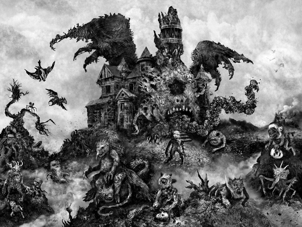
Below, cover artwork for The Haunted Forest Tour (Halloween 2007). A novel by James A. Moore and Jeff Strand.  Cover and interior art by Glenn Chadbourne.


The combination of extraordinarily spooky stories, original artwork and custom binding makes for a wonderful set of collectors items.  Currently available for Halloween 2011: 
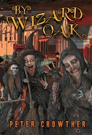
By Wizard Oak, a novel by Peter Crowther, with artwork by Glenn Chadbourne.


And pre-orders are being accepted for the next volume in the series, Blood Harvest by James A Moore.

All of the Halloween publications are issued as limited-run, hardbound, illustrated and slipcased or traycased editions.  It's evident how much care is taken with these - Mr. Miller's dedication to the genre shines clearly.

I know I'm getting into the Halloween spirit already.  (What, it's only two months away!  That's not too soon!)  And I am definitely looking forward to diving into one of these for Castle Macabre's Frightful Fall read-a-thon.  Possibly more than one. Oh yes, I love this season!


Monday, September 5, 2011

Lavish Bookbinding by Monique Lallier


While browsing my usual online book haunts, I came across this 1931 Metropolitan Museum publication that had been re-bound "in full black morocco with tan morocco onlays on front and rear cut in the silhouette of a city skyline" by one Monique Lallier.  I hadn't come across her work yet so I thought I'd better do a little further investigation.

Metropolitan Museum

I was thrilled to discover she is a contemporary artist that is still creating and teaching.  From her website:  "Monique Lallier is an internationally recognized book binder & book artist. She began her studies in the 1960s in Montreal at Cotnoir Cappone School of Fashion & L'Art de la Reliure book binding school with Simone B. Roy. She continuued on to Paris, with Roger Arnoult, Centro Del Bel Libro in Ascona, with Edwin Heim and Solothurn, Switzerland with Hugo Peller. Moniques' work may be found in the collections of: McGill University, Montreal, St. Joseph Oratory in Montreal for the Pope Jean- Paul II, Louisiana State University, University of North Carolina, as well as many private collections in USA, Canada, Europe and Japan."

Femme Revee. Box with hand fabricated silver corners and center piece. UNCG, Jackson Library special collection.
The sampling of book bindings available for view at her website is incredible.  I've selected a few to display but there are so many more!  Two images on the first page honor the beautiful Jacqueline Kennedy, both the book pictured below and a box designed to reflect a dress of her fashion:

Jacqueline Kennedy

Below:  "The Knell of Cock Robin. Full leather black morocco French technique binding with an agath inlaid in a relief pattern. The front cover opens to reveal a forest made with Japanese papers. Embroidered endbands. Gold titling on the spine. Full leather pull-up box with red leather onlay. Bound in 1994."

The Knell of Cock Robin
"Antony and Cleopatra by William Shakespeare, designed and produced by Ronald King. Circle Press Publications 1979. Copy A.P. XXXI/XL. Full purple goat skin with hinged flap on the front board with silver leather inside, held closed by a snake clasp. Graphite top edge. Edge to edge doublures and fly leaves. Bound in 1988."
Antony and Cleopatra
Monique Lallier is currently still teaching, both privately and for the American Academy of Bookbinding. You can view more of her creations at her website, Monique Lallier.

*All images and quotations above are property of Monique Lallier's website, all rights reserved..

Saturday, August 27, 2011

The Master in Cafe Morphine: An Homage to Mikhail Bulgakov

Finally! At long last! My one luxury purchase of the year has finally arrived:

The Master in Cafe Morphine: An Homage to Mikhail Bulgakov


This limited edition was published in June of this year by Ex Occidente Press, out of Bucharest.  I am the proud owner of copy #37 of 100.  

The Master in Café Morphine: A Homage to Mikhail Bulgakov is an over-sized sewn hardcover book of 363 pages with endpapers, a full-colour frontispiece and a dust-jacket. Deluxe cloth boards with folio. Edition limited to 100 copies."

Edited by Dan T. Ghetu, this homage to one of Soviet Russia's most well-known author and playwright contains twenty-one original stories.  Contributing authors include Allyson Bird, Adam Golaski, Rhys Hughes, and more.


Bulgakov is best known for his world-renowned masterpiece "The Master and Margarita", which was published posthumously by his widow in 1966 and remains one of my all-time favorite novels.


This monocled portrait above was created by C. C. Askew of the Eternal Sekret City.


The paper stock is gloriously heavy and smooth. The font is Elegant Garamond in size 10.5. 


If I have one criticism, it's about the paper stock used for the dustjacket.  It's heavily textured, which I think distracts from the incredible jacket artwork created by artist Santiago Caruso.  You can see a large image of the original artwork here.  It's a fairly minor flaw, though.  The jacket is gorgeous and the imagery beautifully represents Bulgakov's themes.  And this interpretation of the Cat is just fantastic.


And now I think I shall settle into my big oversized reading chair and begin to read this eagerly-anticipated volume. Until later.....

Sunday, August 14, 2011

Punch & Judy: Modern Interpretations part 2

Always on the look-out for Punch & Judy references, I happened to stumble across this interesting work from Circle Press:

"The Left-Handed Punch".  Artwork by Ronald King, in collaboration with poet Roy Fisher. Guildford, 1986 (out of print).   A somewhat more abstract take on the tradition.

Image from The Left-Handed Punch

From the website:  "The fifth collaboration of artist and poet in a modern version of the Punch & Judy drama. Entirely screen printed with the exception of the introduction, titles and colophon, which were printed letter-press in 14 pt Baskerville. 80 signed copies made up of ten 4 pp French-folded sections – 38 x 28 cm on Somerset mould-made paper. The six scenes and epilogue (which include 12 articulated puppet designs) are held in paper folders within a red cloth-covered folder inserted into a hand-printed striped cloth slip-case." 

Image from The Left-Handed Punch


Image from Anansi Company
Ronald King and Roy Fisher have collaborated on many interesting and colorful publications.  On a related (puppet-ish)  theme, "Anansi Company" is a modern rendering of the folk tradition of Anansi the Spider, and includes "screen printed removable wire and card puppets":


Very interesting publications- I am quite pleased that I found them.

About the press:  "CIRCLE PRESS, formed by Ron King in 1967, is both part of a tradition and a breaker of tradition. The stages of its life are marked not only by the individual natures of those whose books and prints it has published but also by the differing character of the decades through which it has passed. The Press has been highly productive for over forty years and has had a profound effect, directly and indirectly, on other artists working with books, for it has provided a continuity and a context against which such activity can be measured, even for those whose output and philosophy are utterly different or even opposed."


Wednesday, August 10, 2011

'Heart of Darkness' - Deep Wood Press

Take a look at this beautiful edition of Joseph Conrad's 'Heart of Darkness', illustrated by Marc Castelli:


Published by Deep Wood Press, this book won the University of Texas's Carl Hertzog Award for Excellence in Book Design, 2010, and it's easy to see why.  The binding is richly textured and beautifully detailed:

"Full goatskin binding with calf onlays in debossed panels depicting images from within the book. Enclosed in a drop spine box with an extra folio of prints from the book."

The illustrator is Marc Castelli., an artist who's life and work has been steeped in maritime culture.  His lifetime love of boats and the water clearly made him a perfect choice for illustrating this classic novel.

~ "Published with 36 original drawings by renowned maritine artist Marc Castelli, this limited edition of Heart of Darkness summons us to listen to Marlow's story which echoes even today."


The publication was a collaboration between Deep Wood Press and Chester River Press.  More information and more detailed images of the book can be seen at this Deep Wood Press page.


For those who haven't read it (and no, watching 'Apocalypse Now' doesn't quite count), here is more about the book from Deep Wood's page:

"Joseph Conrad's masterpiece, Heart of Darkness, continues to ignite the interest of readers and literary scholars alike.

The simple story of a sea-captain hired by Belgian colonial ivory merchants to search the Congo River for a disaffected company employee turned pathological demigod becomes as deeply a sympolic and frightening descent into the maelstrom of moral consequence as Dante's expedition through Hell.

If there is a moral compass to be discovered within its pages it is to be found spinning between the cardinal points of avarice, genocide, values and conscience as Marlow steams deeper into the darkness of the jungle and the core of the human psyche in his search for the enigmatic Kurtz."

Tuesday, August 9, 2011

A Graphic Interlude

Thanks to Mad Hatter for the heads-up on this one: Mike Mignola's very impressive cover art for the upcoming graphic novel 'Joe Golem and the Drowning City': (You can pop over to their post for a larger / more detailed look)


Mignola is one of my long-time favorite illustrators.  I have his 2008 HPLovecraft Film Festival poster framed and hung prominently in my house:


Hm, yes, ok, a bit of theme there.  Still, I am very much looking forward to this release.  Details (filched verbatim from Mad Hatter, again, many thanks):

Here is the pitch that originally sold the book, which gives us a bit more color:
A supernatural-steampunk illustrated novel following an orphaned teenage girl, an aging conjurer, a lunatic scientist, a Victorian occult detective, and the stalwart sidekick, Joe Golem, as they struggle for the fate of an alternate 1970s Lower Manhattan, which sank into the water during a catastrophe in 1925, leaving those unwilling or unable to abandon it to make a new life in streets turned to canals.
Joe Golem and the Drowning City, will be released March 27th, 2012 from St. Martin's with at least one sequel to follow. Mignola will be doing about 100 pieces of art of the interior as well. Mark down another 2012 book for your to-procure list.

Monday, August 8, 2011

Interpretive Book Bindings: Mia Leijonstedt

Finnish-born Mia Leijonstedt is an award-winning book artist currently residing in the United Kingdorm.  From her Artist's Statement:  "The book as an object is symbolically a very rich and independent format. Its history and cultural significance provide endless scope for artistic discoveries and interpretation, not only being a container for stories but being a story in itself, its whole life and existence in time being read from its tactile details and structural function. "

I will begin with her custom book bindings, which are designed to represent objects that could be pulled from the books themselves.  These bindings are rich, multidimensional, and thematically linked to the stories they hold.  Her interpretations are reflect a deep understanding of the texts.

Gulliver's Travels by Jonathan Swift
For example, the binding above for Gulliver's Travels:  "The book is illustrated by Arthur Rackham and is bound in black goat skin. Inner covers are lined with dyed reindeer parchment. Five strands of black and dyed tan leather cord are couched onto the covers. The strands extend from the fore-edge and have cast pewter beads on the ends – as though the book itself was Gulliver and the cords used to tie him down as in the story." ~Artist's Description
Sinuhe egyptiläinen by Mika Waltari
And another:  "This classic Finnish novel is inspired by the ancient Pharaohs’ Egypt. Edges are gilt with underlying edge paintings of Egyptian gods and the leather work echoes mummy-wrappings. The inner covers are lined with papyrus." ~ Artist's Description

Peter Pan in Kensington Gardens by J.M. Barrie
Finally, this lovely binding of a 100-year old edition of Peter Pan is just incredible.  The appearance of the edges is the natural result of aging and was left intact.

~~~~~~~~~~~~~~~~~~~~~~~~~~~~~~~~

Aside from bindings, Leijonstedt also creates book sculptures.  The one that first captured my attention, and led me to research this artist further, is this tribute to the imaginary Spells of Merlin:
Lost Spells of Merlin
 And below is a piece inspired by an ancient Tibeton monastery book:

Mandala Book
I encourage you to visit the artist's website (Mia Leijonstedt) and view these and many more images in greater detail. Leijonstedt's work is beautiful, intricate, and respectful of literary works and their authors.  You can also find links there to her blogs and to her Bookbinding Courses for Beginners (in the UK).

Friday, August 5, 2011

EPIDERMIS: The Poetry of Skin

This interesting crossover of publishing, art and biology was recently brought to my attention:


EPIDERMIS: The Poetry of Skin is a collaborative effort from photographer Doug Prince and poet Scott A. Gallaway, and includes an interpretive essay by Andrew E. Hershberger.  I found the images to be beautiful, and the sample pages available for viewing here are quite compelling.


Artist's Statement:

"Epidermis is the outermost layer of the skin. It forms the waterproof, protective wrap over the body's surface and is made up of stratified squamous epithelium with an underlying basal lamina." - The Encyclopedia of Medical Terms

"These images are the latest state of a body of work started in 2005 titled, Dermis.  I am interested in transforming digital images of human skin into new, graphic compositions.  I select images as a working pallet based on color, texture and gradation, and their potential to lend themselves to my own aesthetic interest. Then I digitally reconstruct them into new forms, surfaces and lines.   The resulting images often parallel forms found in geological, anatomical, and biological subjects.  I am motivated by the joy of creating new organisms and the discovery of new landscapes.   I am also interested in maintaining some of the original photographic details, as artifacts, in the new composition.  This allows a play and tension between these photographic elements and the abstract frameworks in which they are embedded." ~ Douglas Prince

I got in touch with Prince to ask a few questions about his work on this project:

BA:  You have a large portfolio of artwork on your site. What inspired you to create a book of your photographs?
DP: The book format seemed like a natural culmination of a body of work and an extension of the digital process. It was something that I could organize and design and present to an audience.  Although the distribution is a challenge and the audience is small. Since I couldn't find a "regular" publisher, I decided to setup Maple Seed Press and do it myself.


BA:  How did you choose this body of work to present in a book form?
DP: I was working on EPIDERMIS, at a time when Andrew E. Hershberger and I were both teaching at the New Hampshire Institute of Art.  Andrew was teaching a history of photography course and I was teaching photography. We started spending time discussing photography and related topics, he became interested in the work I was doing and I was very pleased that he was interested in working on an interpretive essay for the book project. This was an inspiring and fruitful partnership, we worked together discussing the concepts in the essay and he participated in the editing of the images.


BA: Was the experience of gathering your artwork into book format and collaborating with Scott Gallaway a positive one? 
DP: Andrew introduced EPIDERMIS to Scott when he returned to GBSU, Bowling Green, OH.  Scott responded to the images and asked if he could do a set of ekphrastic poems for each page.  I was delighted with this addition to the book.  Both Andrew's and Scott's contributions have expanded the insights into the work.

BA: Do you have plans on publishing other books in the future?
DP: The next big project I will be working on is a 50-year retrospective (from silver to pixel), collaborating with Andrew.  Hopefully we will get the interest of a museum and publish a catalogue.

I would like to acknowledge an important influence:  Ralph Gibson's understanding of the beauty and power of the book has been both instructive and an inspiration.  He published his work, pre-digital, through Lustrum Press, 1970-1985.   http://www.ralphgibson.com/

~~~~~~~~~~~~~~~~~~~~~~~~~~~~~~~~~~~~~

Other book-form projects by Prince:  The exhibition catalog for All Possible Worlds and Evolving Vision: Explorations in Digital Image-Making.  You can see more of his artwork and larger, more detailed views of the sample pages for EPIDERMIS at his website, DouglasPrince.com.  The book itself is available for purchase here.

Tuesday, August 2, 2011

New from Arion Press: The Sundial by Shirley Jackson

As a diehard Shirley Jackson fan, I am very excited about this.  Recently released by Arion Press: The Sundial by Shirley Jackson, with an introduction by Diane Johnson, and with illustrations by Miles Hyman.

Miles Hyman, The Sundial, 2011
Publication details:  "The Arion Press edition format is large octavo, 10-1/4 by 6-1/2 inches, 226 pages plus 56 unnumbered pages for the illustrations, 282 total. The text pages are printed by letterpress from Fridericus type in Monotype composition, with Winchell type handset for display, on Zerkall Book, a German mouldmade paper. The illustrations are printed by four-color offset lithography on McCoy Silk Book. The binding is full cloth with an inset panel on the front cover, with a detail of a sundial in color from the endpaper image, and a spine titling label."

Artist Details:  "Miles Hyman is an American painter and illustrator living in Paris. He is the grandson of the author Shirley Jackson and brings a deep understanding of her life and work to this project. He previously illustrated  Jackson’s famous short story “The Lottery” for an edition published by Farrar Straus & Giroux. Hyman was born in Bennington, Vermont, in 1962. He attended Wesleyan University and moved to Paris in 1985 to study drawing at the École des Beaux-Arts. For five years he was involved in music, performing with the Choeur de l’Orchestre de Paris under Daniel Barenboïm. As an illustrator he has worked for the French publishers Gallimard, le Seuil, and Hachette, and the newspaper Le Monde. In the United States, his work has appeared in books for Knopf, Viking, and Chronicle Books, as well as The New Yorker and New York Times. His drawings and paintings are exhibited in galleries in France and Switzerland"


Other titles illustrated by Hyman:


You can see much more of Hyman's work at his website.

Sunday, July 31, 2011

Punch & Judy: Modern Interpretations part 1

Punch and Judy by Carlo Giordano
I've long been enchanted by puppetry, and have a particular fondness for the classical Punch & Judy and their associates.  The history of Punch & Judy dates back to the 17th century, although the characters have roots in the Italian Commedia dell'Arte tradition which began as far back as the 16th century.

Unlike most modern children's entertainment, the Punch & Judy tale was quite dark, with Mr. Punch basically killing off all of the other puppets including The Baby, Judy, The Constable, and ultimately The Devil.  Mr. Punch was a thoroughly unlikeable character, selfish and mean, and yet he has attracted audiences and devotees throughout the centuries.


In 1992, Neil Gaiman and Dave McKean published "The Comical Tragedy or Tragical Comedy of Mr. Punch".  Their interpretation highlights the darker, creepier aspects of Mr. Punch and the performers (carnies, hucksters) who have kept the beachside puppet show alive over the years.

The story follows a young boy who is sent to his grandparents' house near a beach, where he finds an old rundown puppet theater tent. There he experiences the terror of watching Mr. Punch throw the baby out the window for the first time.

Later he visits his grandfather's spooky, failing arcade a short ways from the beach, and meets a Professor (as the puppeteers refer to themselves) and his bottler (who collects the pennies and interacts with both puppets and audience).


The artwork is a blend of illustration, photography, and collage used to great effect.  It evokes feelings of age, dust, crookedness and defeat, and really captures the strangeness and inconsistency of adults as seen through the eyes of a child.


Gaiman and McKean are long-time collaborators and are perhaps best known for the Sandman series of graphic novels and, more recently, Coraline which was turned into a popular film.  This may be my favorite creation by them, though.  It's a great tale which is true to the tradition and history of Punch & Judy, and the execution of the story, text and artwork is beautiful.


Check back soon:  In the next edition of Punch & Judy: Modern Interpretations,  we will explore another contemporary publication, The Comical Tragedy of Punch and Judy by Christopher P. Reilly and Darron Laessig.